

Now that the paint from the early stages of this has almost dried to the touch and I could use a brake from
other work maybe I'll see if I can finish Barn #1.This is what it looked like a few weeks ago:
When I looked at it a few hours ago I observed the following: -the upper left area of the sky didn't look 'conscious'- too much ill considered texture, -the top edge of the light clouds above the barn seemed poorly designed too much sameness-
-the tree on the left is flat- no form or volume-brush strokes too similar,, -the right side or the end wall of the small building is too dark and the tree beside it doesn't seem to be spatially in front of it,-
the barn roof isn't finished- is looking too sloppy, an unfinished loose, not overworked look is good but this is sloppy, the light I used to lighten it looks hazy ,-the fence is too ...one value of grey
and the red of the vine/ ivy is too spotty-
Also I remember that I have not yet used any darks as accents in the barn wall-the boards .....no doubt there will be other things that I will notice as I go along
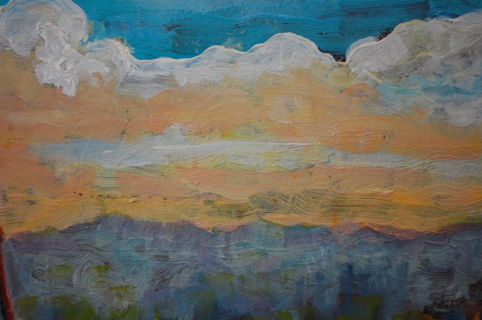
this is before

This is after:-it is partially the light from the photograph that makes the surface seem so hazy/milk
-you can tell here too that I put some lighter shapes into the Vine

Next that annoying little dark triangle on the small building

better (I guess)
You may have noticed that dark line under the roof of the small lean-to on the right-
the next two sots will show a difference-these are close up shots -so when the work is seen at arms length
the effect is not the same as what is seen here on the scene (sometimes I wish it were)

that dark line just seems to sit on the surface.so.......

not so noticeable eh ? but what's this ?? -a stray brush stroke
just above the faded green (above the roof) carelessness tut tut
Ok it's gotta go

ok now its' gone...what's that ugly yellow spot ? I didn't put that there
..........somebody's been in my studio messin around!!
damned waste of time -if I did things right in the first place I wouldn't have all this adjusting and fixing up to do!- OK it's Gone SEE!
What's next ? How about comparing how much more light there is in the barn wall and how there is an
hour or so of defining things
this is from a couple of weeks ago -my how the time flies when you have to get up every rotten snowy winter morning and clear the driveway.

the next is after some black and white were added to the boards- notice how some of the brush strokes don't look so poorly applied-this is a good time to compare that dark wall on the small building with the way it is now and to compare the rather flat hard edge of the light orangish band in the sky above the tree on the r far left
I think the fence is better now
yeah I know this little detail (look below) is better than the whole damned thing put together
the story of my life !-
it does however give me an idea of how I would like to approach the next one
remember I said that-(I'll forget)check out the band of light sky above the tree on the left(wish I had a pointer here-like my good old laser pointer)
here is the almost final......................


Just a reminder
this Panel is 9 7/8 , X 14 7/8- just a bit bigger than legal size paper at 8 1/2 X 14
and this detail of the fence is about the size of the normal
3 X 5 photograph.
For a while I thought: "this is it ".good enough- not a master piece but not something I need to be ashamed of either-then as I put it upon a shelve in better light I noticed something right away.
I'm not going to tell you what it is, but anyone would and will agree that there is something 'off 'about
one of the major parts of this composition- it's a fairly big change and will take at least an hour.
Send me $10.00 and I'll tell you ! -no? OK then you'll have to wait-
maybe a week, maybe a month, maybe longer- OK then $ 5.00
to see the change that I'll be making
you'll kick yourself for not seeing it! Right now I have to go and clear the drive way. Ruth is going
to the gym to pump Iron- wonder woman
until next time B.
I have a guess... but I'd hate to spoil it if you aren't accepting guesses. If I get it right would you send me $5? ;)
ReplyDeleteOK go ahead - guess
Deletebut it's simple so don't over think it ~
Sure I'll send you the a picture of the guy my grandfather helped get elected - the 7th P.M. of Canada. Grand dad-Morgan Dalton met him in Lucknow in 1895 and worked on his behalf.............
you'll have to email me your address B.
Tried to email your hurontel address with a notice of the November exhibition at the Liss Gallery in Yorkville. Looks like a nice show, with some similarities to your work.
DeleteI can be reached at my first name[dot]last name[at] yahoo[dot]ca.
If I send you $5, will you send me a letter, my friend? I sure do miss hearing from you.
ReplyDeleteHey Goddess you don't have to give me any incentive
DeleteI've just been busy writing and rewriting -actually I'm mostly just editing for the most part... I'll tell you about it
I'm watching the mail box, my artist friend. I've not heard from you in two months. Write soon.
ReplyDelete