Friday 28 February 2014

Observation # 13 -follow up to #11

                         If I am to keep things in order this is # 13 but it should be numbered 11.1                                                                           It is the last day of February-the cold persists...
          If anyone remembers, I claimed that there was one major aspect of that first barn painting in Owen               Sound that I  thought was 'off' ...well there were probably more 'off' parts than that...but never mind....
                                Here are the before and after photos showing the change(s) I made
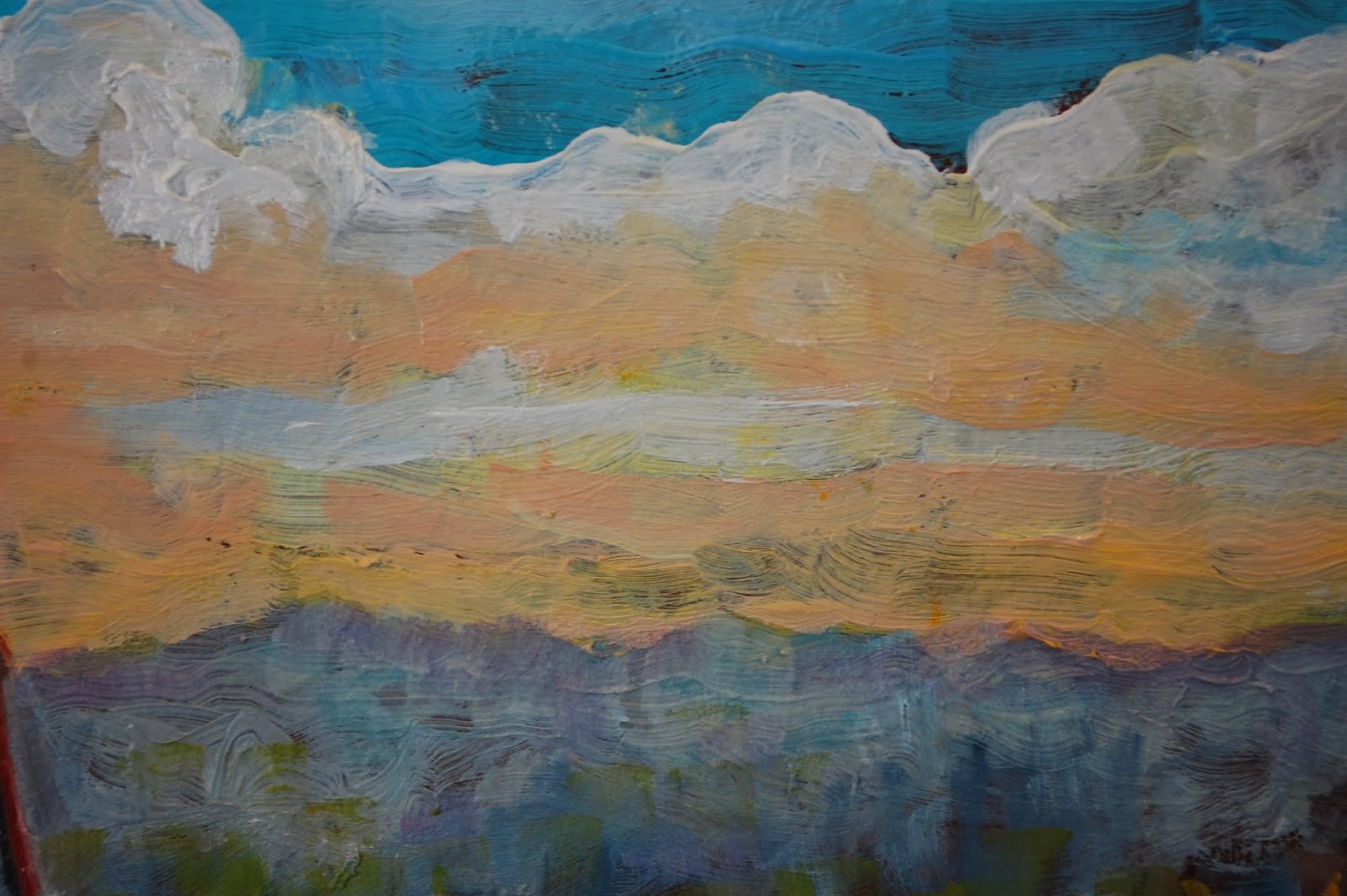
this is the way it was the last time it was seen-the fence seemed too white 
a pure stark white probably looks OK on the screen bit trust me 'in person' it was too white
(sorry these photos should have been taken under the same conditions...alas...)and this painting IS better in person- aren't we all!
        ........... so about an hour ago I dug out the mars black, Payne's grey, titanium white and burnt umber
          and proceeded to  reduce the intensity of the white -to almost a middle value grey in some places.
I had to use pure undiluted paint  because of the rule "Fat over Lean'   which refers to the necessity of never putting a lean or diluted paint over a thick heavy application of paint-----could cause cracking  down the road......Now, if this had been done in Acrylic it would have been much more simple just to put a light wash over the too light parts
                      This little experiment is now over. I'm not sure if I'll continue with oil or not-I appreciate all the  qualities about Oil paint that in many ways make it superior to acrylic. If I do another I'll try  cotton                                                           canvas-a much more flexible surface.
                       One of those superior qualities of Oil is that nice luscious texture one can get.
            If you ever get a chance to see an original A.J.Casson,1898-1992- one of the Group of Seven, check out his textures. His work is much more 'labored' than Thomson's. Remembering the surface of a               Thomson sketch in oil on an 8 X 10 makes me think my own brush handling in this barn is not very                                                                                 thoughtful.
I might never get a chance to 'name -drop" Casson's name again so- what the heck : I met him in 1970 in the     St Thomas Art Gallery  he was one of the jurors and told me the night of the opening he liked my work. 
            (I was 23 he was 72, he was a kind fellow). I met A.Y. Jackson about 1968 in Kleinburg
at the McMichael Collection. It was a chilly but sunny day and he was sitting outside wrapped in a blanket                       He had a stroke a  sometime earlier- but was smiling and saying brief hellos. 
     Every now and then I drop out to the Leith Cemetery and have a chat with the guy who inspired them             both- Tom Thomson....I imagine Tom to be there even though he's probably up near Canoe Lake in
                                                            Algonquin Park
              The last photo here was taken with a strong raking sunlight-showing the brush work
              -next step- in 6 months-apply a final varnish.-I haven't done that in a long time
                                                                   -farewell


Observation #12 another re-working of a BARN

 It is Feb 28 2014 .
The snow has returned after a few days of relief.
                       Here goes again with another sort of  step by step set of alterations (changes) to an 'older' work
           Sometime, years ago, I did a careful drawing of the following setting in an abandoned farm yard. I did it on unprimmed cotton canvas-it was a sort of experiment and I've told myself not to do it again.-and I haven't.
          The paint (acrylic ) soaked into the canvas and while it was a nice surface to draw on, painting on it was not easy to do because it was so absorbent-so I left it at a stage where I 'thought 'maybe someday I would put a thin coat of Acrylic medium on it and finish it-paint over it some more.
      Well one thing led to another, the years slipped away and I never really gave up on it, but other work seemed more interesting- more importantly my brother actually bought the  thing- then years after when he and his wife downsized -to less wall space-they gave it back to me
                           The buildings were really great to draw and paint both inside and out. Inside the distant barn was a great setting of an old traditional barn interior with things from an other era of farm life. I found some eggs in the chicken roosting nests that were at least 10 years old- vitrified and lots of that evidence of a quick abandonment of the place.Maybe I'll put those on here sometime...
         ( I really should take the time to at least make these  photographs less crooked -maybe next time)
                       the following is the Painting back in the early autumn of 2013- it is 36in X 48in.

After living with it for awhile I decided to make some changes .I had just planted a young maple with large leaves that were just changing their colour so I drew in two leafless small trees-in places where I thought their shapes would improve the composition.
I also decided to make the two cedar fence rails in the bottom more prominent so I lightened them, thinking I would later  bury them in grass and weeds- still leaving them more obvious.
 
considering the location of the trees with some green tape 

Lots more changes took place to do what I thought would make this painting better-
What's Better?
I the past when I showed anyone a painting that 'to them ' looked finished , I would hear :"oh don't do anymore to it ................."Maybe that was good advice sometimes but usually I ignored it and never felt that I had the time or the listener really wanted to endure the explanation of  those principles of design -the stuff of balance-eye movement, the sense of space(overlapping shapes -of light, of colour trying for a unity of colour.... and those are just some of the aspects of (for me) making a painting successful.In this case 'better'
This time, unless it's really not obvious, I think I'll just put the photos up - some show obvious "before and after effects". Some of these may be obviously out of order 


Perhaps I should look again at Alex Colville's moonlight paintings  -no not this time


Making the branches lighter  -too light to start- will tone down later
later...


I have to say a bit about this next image ,because as I was thinking about what to do in that central part where that original large dark green "black hole' at the bottom of a rather featureless wall seemed to create a sort of dead space, I received a letter from a friend in Australia. The letter included a poem by Norman MacCaig-called:
   Summer Farm    I'l quote just the first verse
"Straws like tame lightnings lie about the grass
And hang zigzag on hedges. Green as glass
The water in the horse trough shines.
Nine ducks go wobbling by in two straight lines.

A few years ago when I was prowling around near Kingsbridge  I walked through a field on my way to Lake Huron and noticed an old farm that I have vivid childhood memories of.
I made a detour and after an hour of  memory making- picture taking. I was just about to continue on when I noticed a horse trough. It was all overgrown with weeds growing out of it's dry form,and I remember seeing gold fish in that cement trough....so I took some shots of it ...never knowing when they may come in handy and  now 35 years later MacCaig's poem  awoke those memories.
 Thanks Shell for sending it to me .
while I was at it it seemed that the rail on the left of that group needed a new angle.
...so with a value 7 grey ..well you can see what happened next-


further changes to the vine and the size of the wooden rails...


 A horse tough from that era was usually a cement container sort of like a bath tub.I have seen them under  the downspouts from an eaves-trough, or close to a windmill or a hand pump.After decades of use the 
    edges became rounded and water freezing in them in winter would sometimes cause cracks in the cement.


This was the state of affairs at 4:30  on the last day of one of the meanest Februaries I can remember- All roads in Bruce County closed yesterday to day? .With the exception of some more texture in the foreground and maybe breaking up those large flat green roofs on the distant barn I am almost finished-maybe another 2 long days .Then it's back to the Old uncle's Diary.
I'm always aware of the possibility of tickling a painting to death.It can happen easily if you don't keep your eye on the big picture-Sometimes as you go along pushing this back, sacrificing one part for another
adding -subtracting -when you take a step back it's an : "OH NO!"

 think I'll call it done for today -maybe read this over tomorrow and 
post it -then finish it -post that -then start something new.
It's OK going back like this -sort of satisfying to do a Lazarus
kind of thing,  and I know for sure this work is a lot better than when I left off
working on it all those years ago
 just noticed that hazy brown-yellow light area just behind the barn-take a step closer and it looks like yellow         ground fog-  I kind of like the 'feel' of it but........
Till next time...........................Brian


Monday 10 February 2014

Observation # 11 Feb 6 2014 Barn # 1-PART TWO -probably finished

 Before I return to Barn #1 it might be fun to go back 44 years to the 2 remaining barn drawings from the dozens I did over 3 of the 4 years at O.C.A.-these were done on the spot -often in black conte (a hard chalk)

 Now that the paint from the early stages of this has almost dried to the touch and I could  use a brake from
            other work maybe I'll see if I can finish Barn #1.This is what it looked like a few weeks ago:

When I looked at it a few hours ago I observed the following: -the upper left area of the sky didn't look 'conscious'- too much ill considered texture, -the top edge of the light clouds above the barn seemed poorly designed too much sameness-
-the tree on the left is flat- no form or volume-brush strokes too similar,, -the right side or the end wall of the small building is too dark and the tree beside it doesn't seem to be spatially in front of it,-
the barn roof isn't finished- is looking too sloppy,  an unfinished loose, not overworked look is good but this is sloppy, the light I used to lighten it looks hazy ,-the fence is too ...one value of grey
and the red of the vine/ ivy is too spotty-
Also I remember that I have not yet used any darks as accents in the barn wall-the boards .....no doubt there will be other things that I will notice as I go along 
this is before

This is after:-it is partially the light from the photograph that makes the surface seem so hazy/milk
-you can tell here too that I put some lighter shapes into the Vine

Next that annoying little dark triangle on the small building
better (I guess)

You may have noticed that dark line under the roof of the small lean-to on the right-
 the next two sots will show a difference-these are close up shots -so when the work  is seen at arms length
 the effect is not the same as what is seen here on the scene (sometimes I wish it were)
 that dark line just seems to sit on the surface.so.......

not so noticeable  eh ? but what's this    ?? -a stray brush stroke
just above the faded green (above the roof) carelessness tut tut
Ok it's gotta go
ok now its' gone...what's that ugly yellow spot ? I didn't put that there
..........somebody's been in my studio messin around!!
damned waste of time -if I did things right in the first place I wouldn't have all this adjusting and fixing up to do!- OK it's Gone  SEE!

What's next ? How about comparing how much more light there is in the barn wall and how there is an
hour or so of defining things 
this is from a couple of weeks ago -my how the time flies when you have to get up every rotten snowy winter morning and clear the driveway.

the next is after some black and white were added to the boards- notice how some of the brush strokes don't look so poorly applied-this is a good time to compare that dark wall on the small building  with the way it is now and to compare the rather flat hard edge of the light orangish band in the sky above the tree on the r far left 
I think the fence is better now
 yeah I know this little detail  (look  below) is better than the whole damned thing  put together
the story of my life !-
it does however give me an idea of how I would like to approach the next one
remember I said that-(I'll forget)check out the band of light sky above the tree on the left(wish I had a pointer here-like my good old laser pointer) 
                     here is the almost final......................


Just a reminder
 this Panel is 9 7/8 , X 14 7/8- just a bit bigger than legal size paper at 8 1/2 X 14
and this detail of the fence is about the size of the normal 
 3 X 5  photograph.
For a while I thought: "this is it ".good enough- not a master piece but not something I need to be ashamed of  either-then as I put it upon a shelve in better light I noticed  something  right away.
        I'm not going to tell you what it is, but anyone would and will agree that there is something 'off 'about
one of the major parts of this composition- it's a fairly big change and will take at least an hour.
Send me $10.00 and I'll tell you !  -no? OK then you'll have to wait-
maybe a week, maybe a month, maybe longer- OK then  $ 5.00
to see the change that I'll be making 
you'll kick yourself for not seeing it! Right now I have to go and clear the drive way. Ruth is going 
to the gym to pump Iron- wonder woman
 until next time  B.